Widening app clarity for YesLiberia
I worked with the nonprofit YesLiberia to improve the written content on their upcoming bus app.
The problem
Before I was brought on, there was no copywriting work done on the app content. There were misspellings, incorrect punctuation, and glaring UX concerns.
Project goals
I collaborated with the CEO and the coordinator for the project to breathe new life into the user experience.
My primary goal was to review the current copy and rewrite it according to UX and brand standards.
Disclaimer
The app was created in Google Appsheet, meaning my creative freedom was severely limited throughout the design process.
Before

After

Check in and Check out look too similar at a glance
The Check in/Check out features allow volunteers to track who's on the bus. However, 'Check in' and 'Check out' look too similar, making it difficult to distinguish between in high-stress situations or for those with poor eyesight.
Bus reservations is not a central feature
Bus reservations are not a common, everyday occurrence and are taking up unnecessary screen real estate.
Changes
Changed Check In/Check Out to Pick up / Drop Off
Replaced Bus Reservations with Daily log on bottom navigation
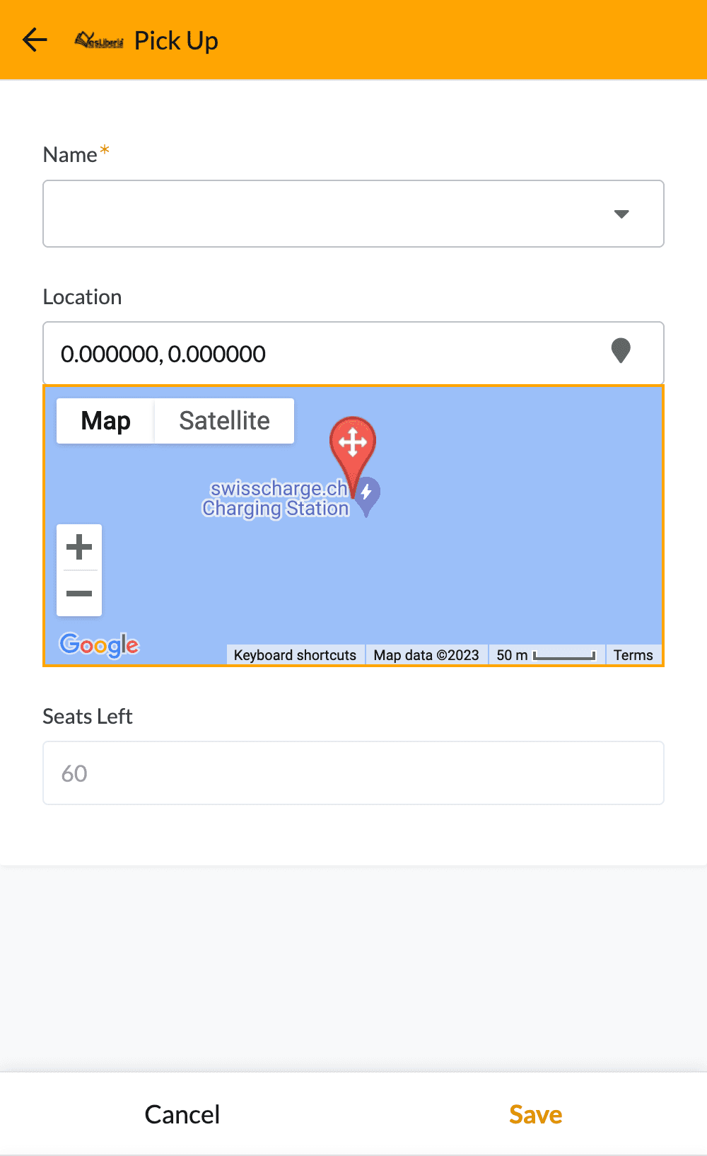
Before

After

'Seats left' is confusing
Using the X/X seats left format can be confusing and is unintuitive.
'Passenger' is vague
The term passenger is formal and uninviting.
No title
The screen doesn't tell users what screen they are on. An unlabeled screen makes it difficult to discern whether volunteers are picking students up or dropping them off.
Changes
• Added titles for all screens
• Changed 'Passenger' to 'Name.'
• 'Seats left: 0/60' is now 'Seat's left: 60.'